STCO
Design for a community
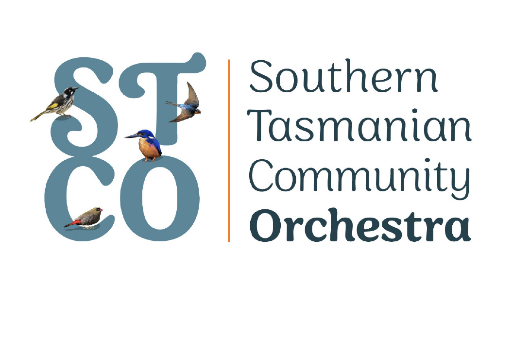
With the challenge of a long name and a reluctance to depart from the STCO acronym, this design solution was warmly embraced by members. This community orchestra has been running for decades but had no real logo as such. A generic clip art music staff image was used for many years.
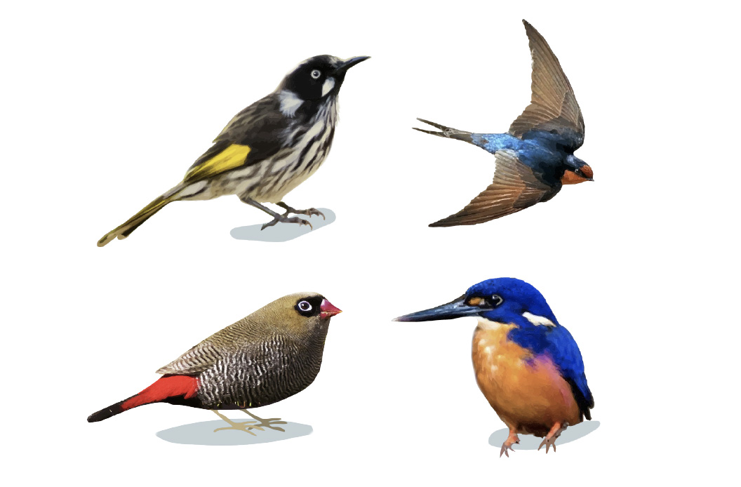
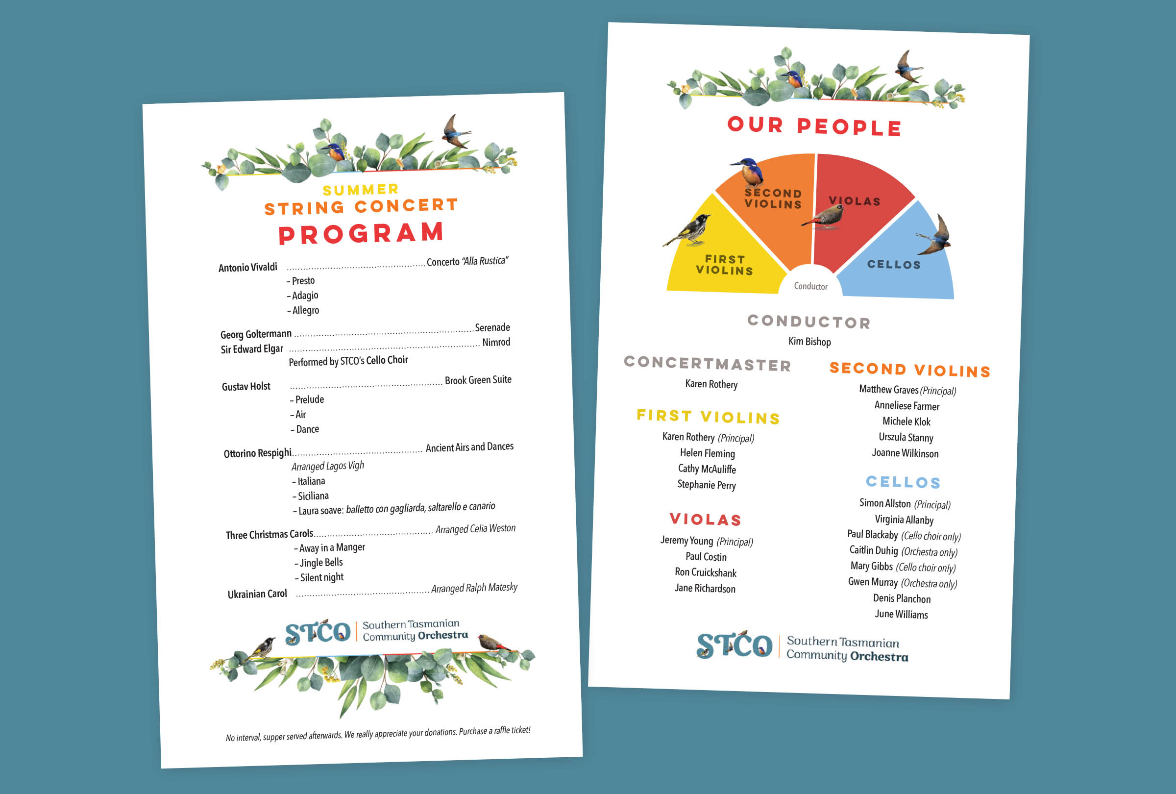
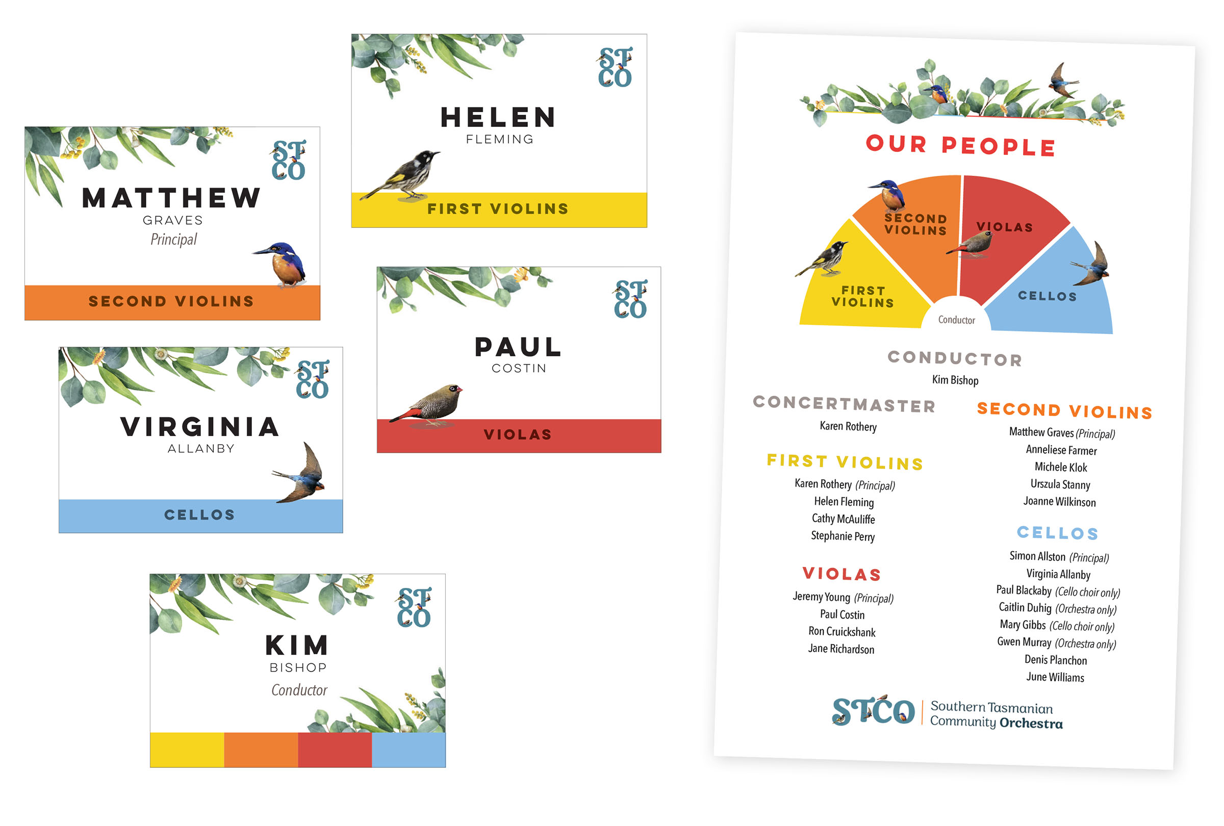
Brand assets were also developed for this identity. The orchestra consists of four string groups, first violins, second violins, violas and cellos. Tasmanian honeyeaters, swallows, firetails and kingfisher birds
were selected to represent each category of players.
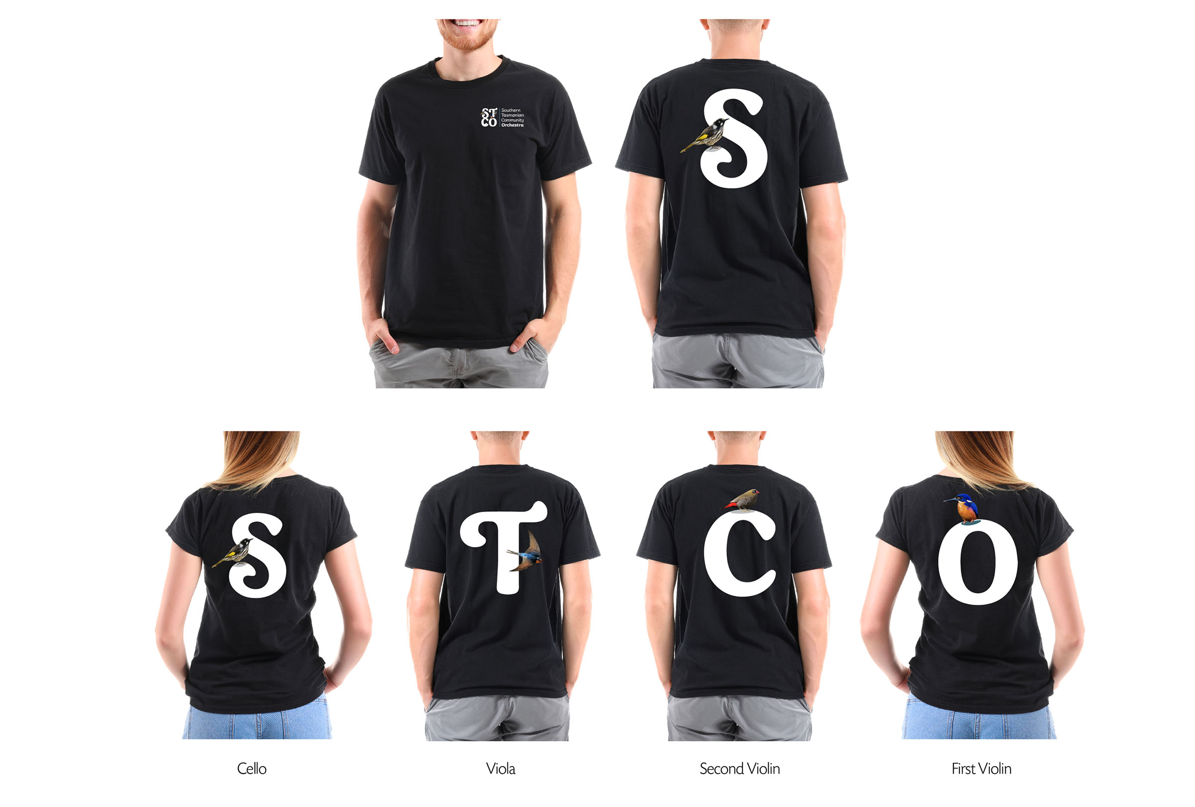
A tee shirt was designed, with each section of the orchestra ‘owning’ one letter of the acronym STCO.
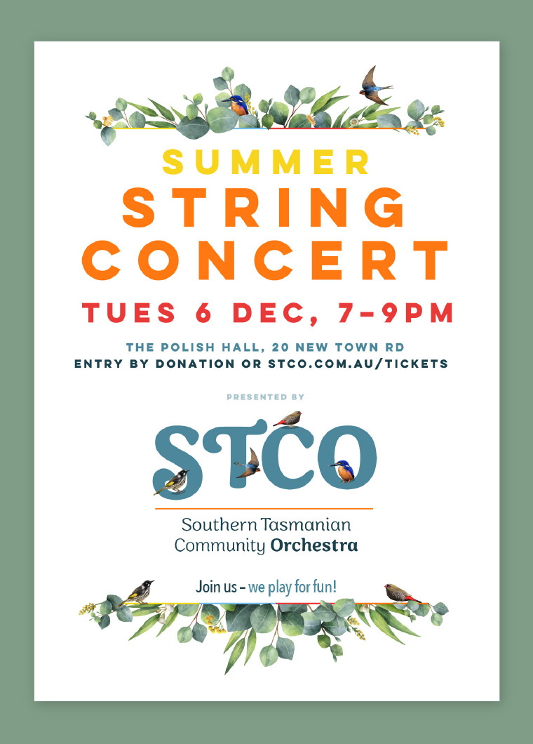
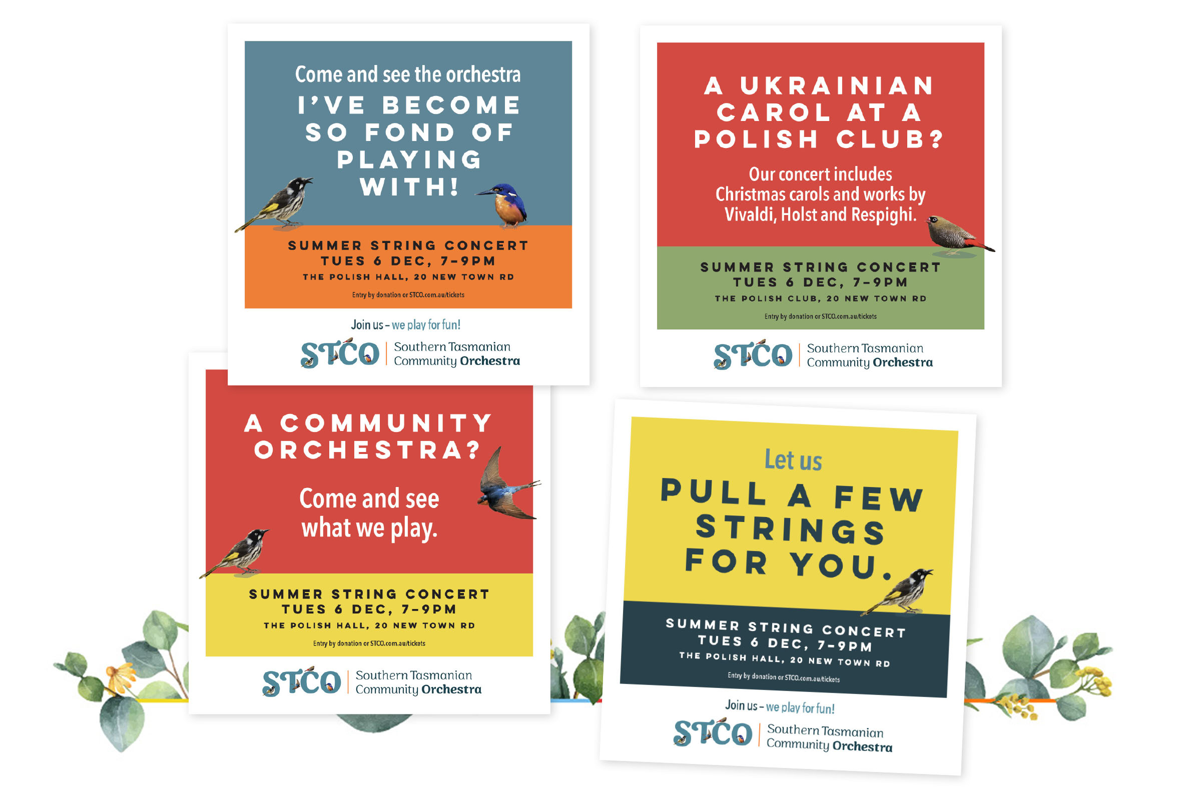
Posters went up all around New Town, Lenah Valley and North Hobart to attract locals. Flyers were letterbox dropped around the area. Attendance and revenue were boosted remarkably from previous years.
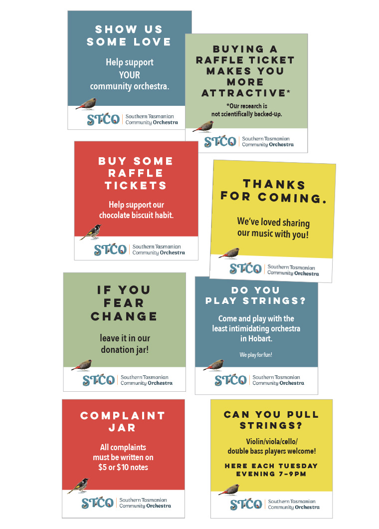
On the evening of STCO’s main fundraising concert, donation table signs attracted many more smiles
and donations. A suite of social media tiles provided to members helped to raise awareness, boost ticket sales and attract new members.
![]()
