St Lukes Health
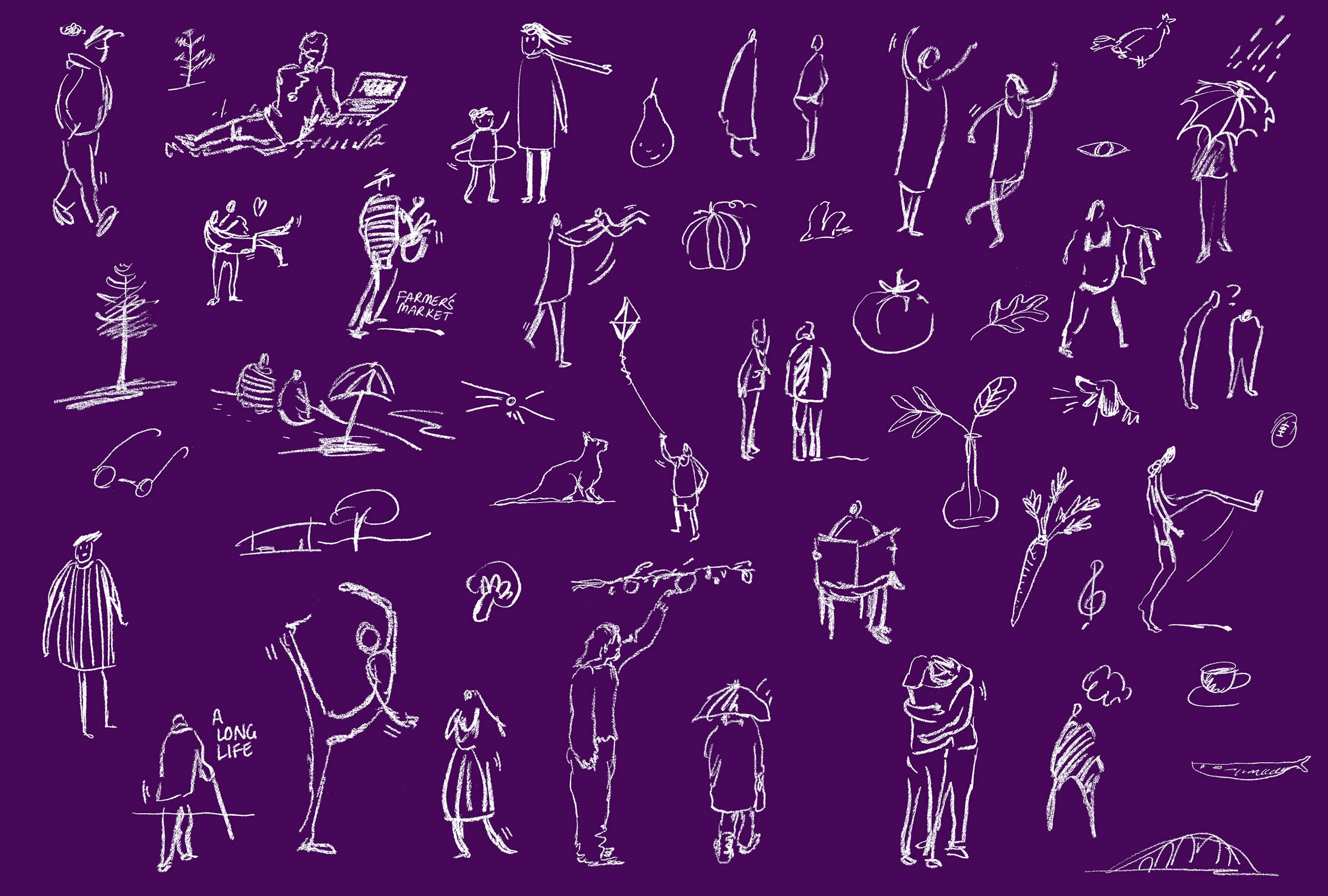
Napkin sketches sized up
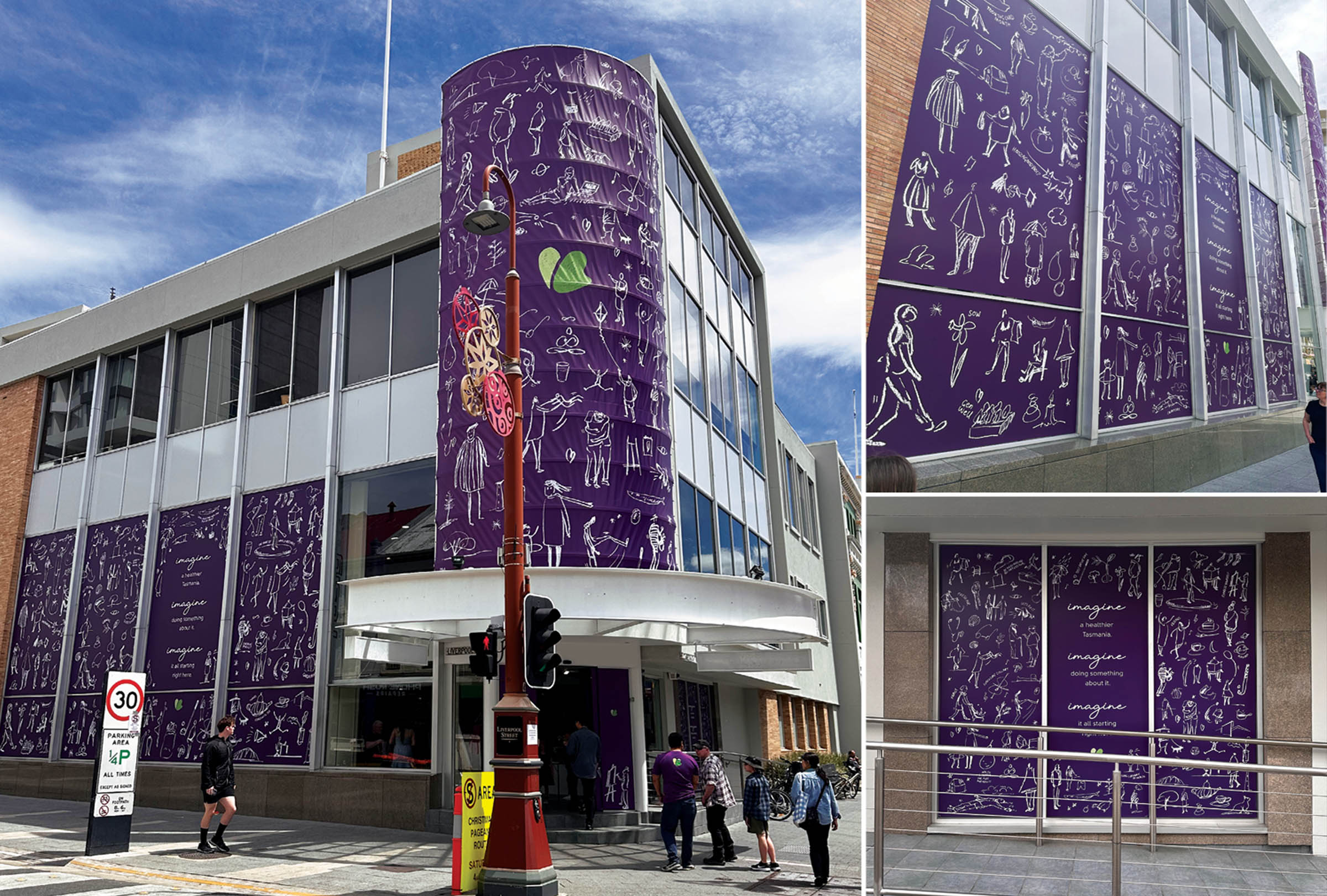
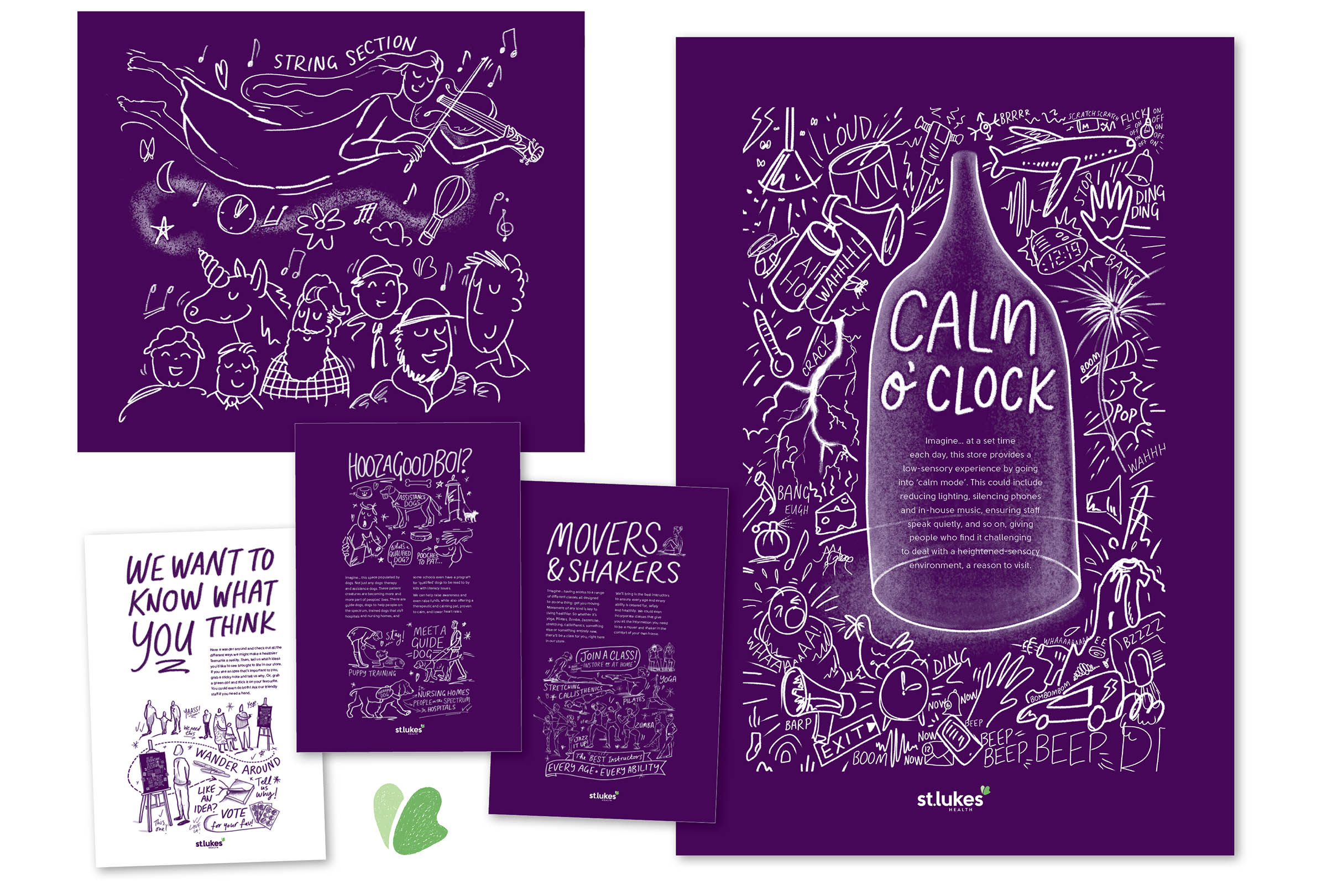
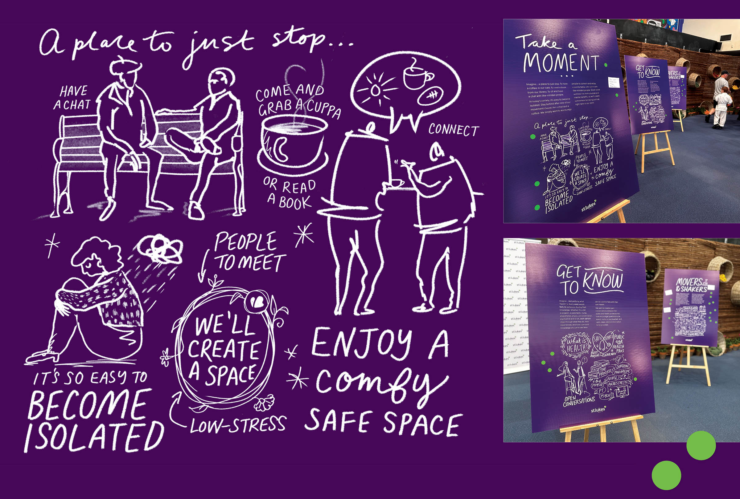
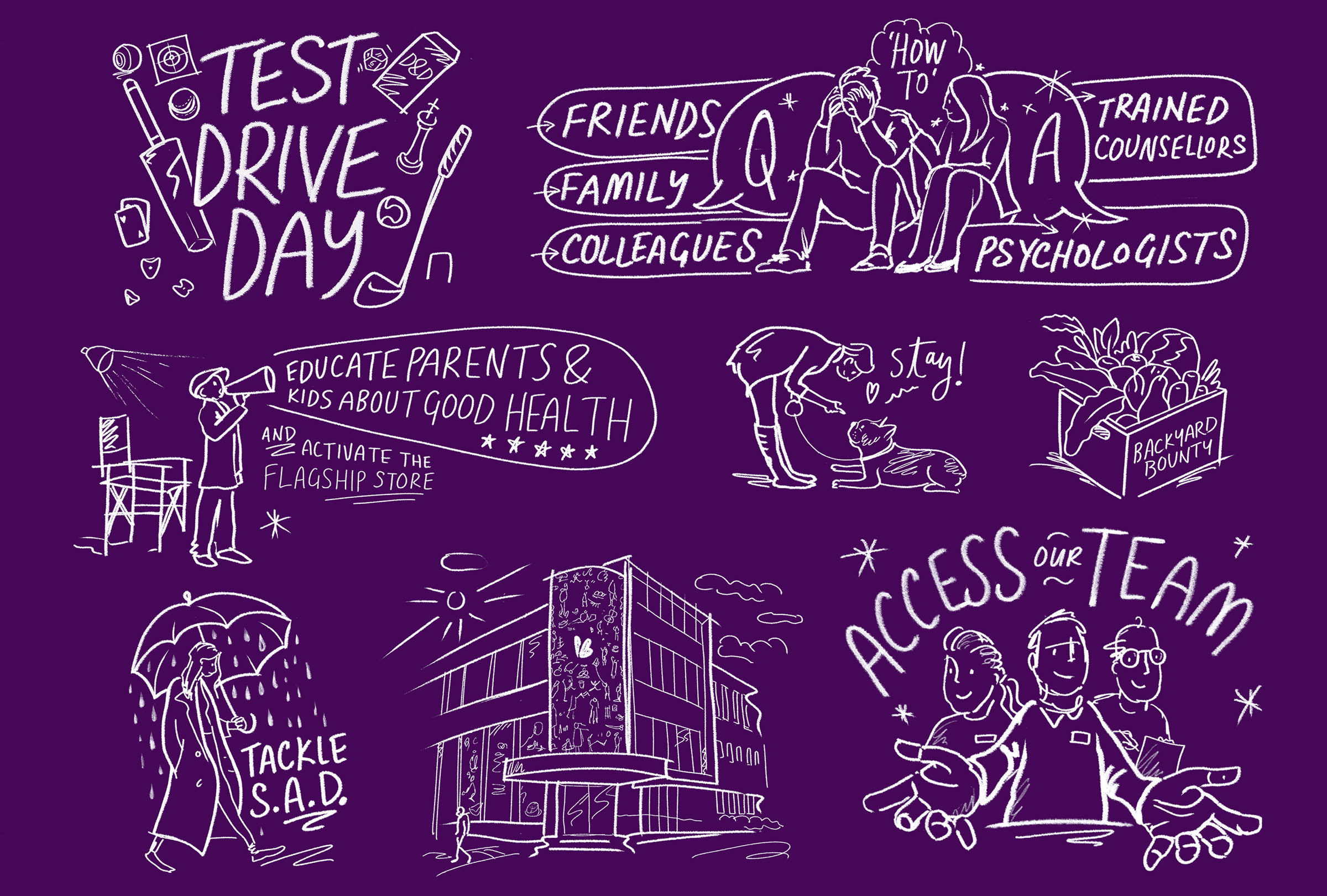
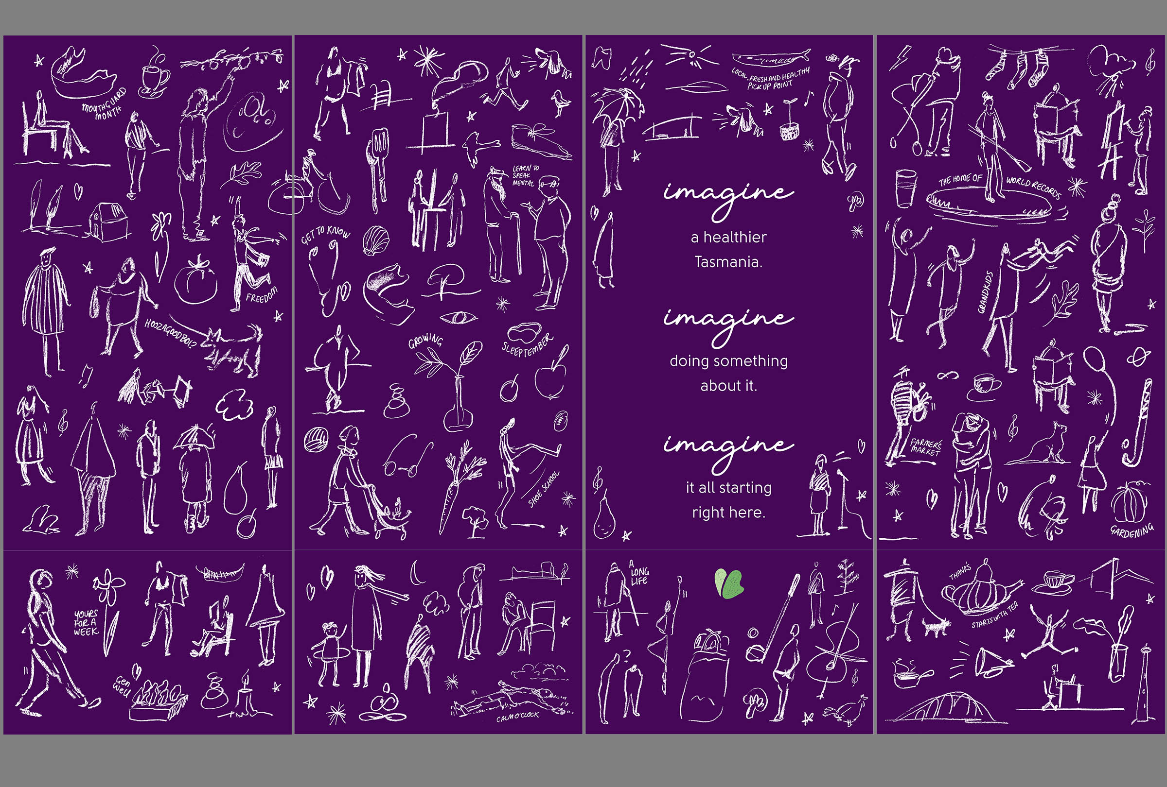
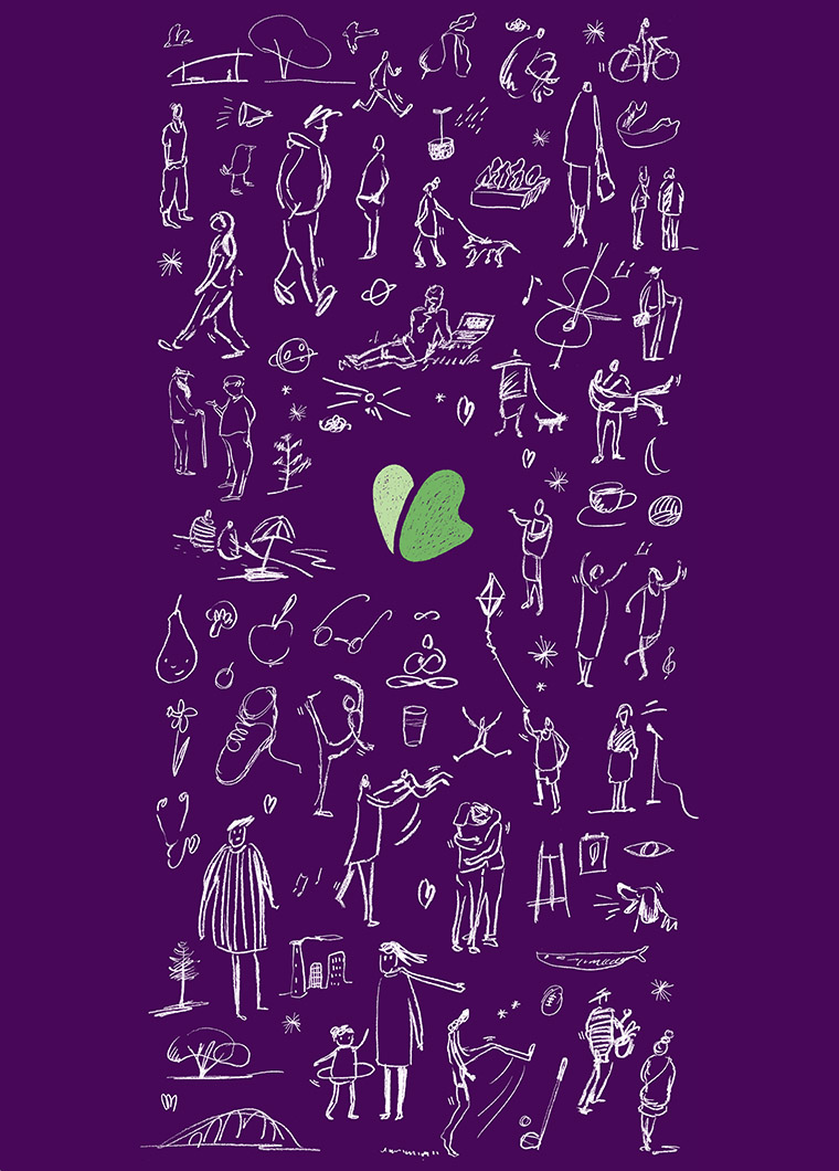
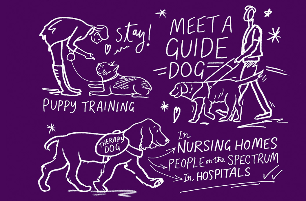
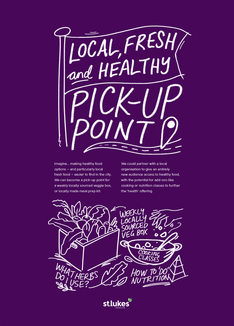
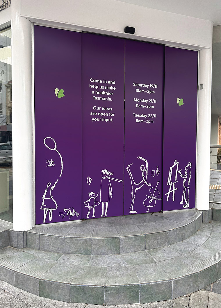
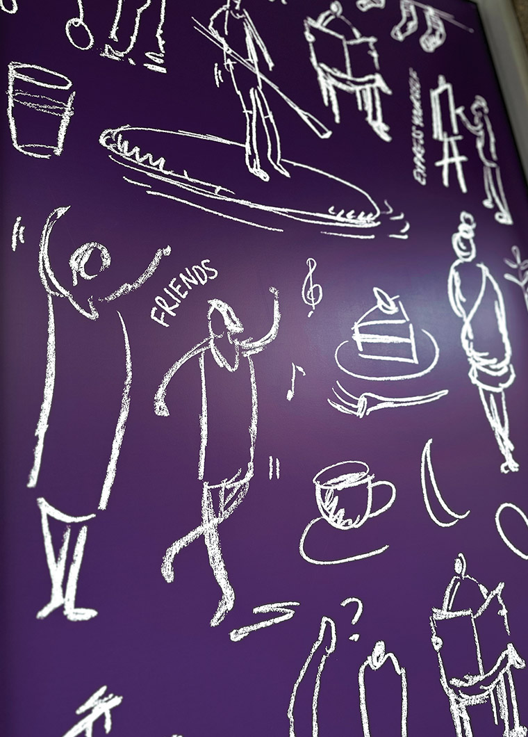
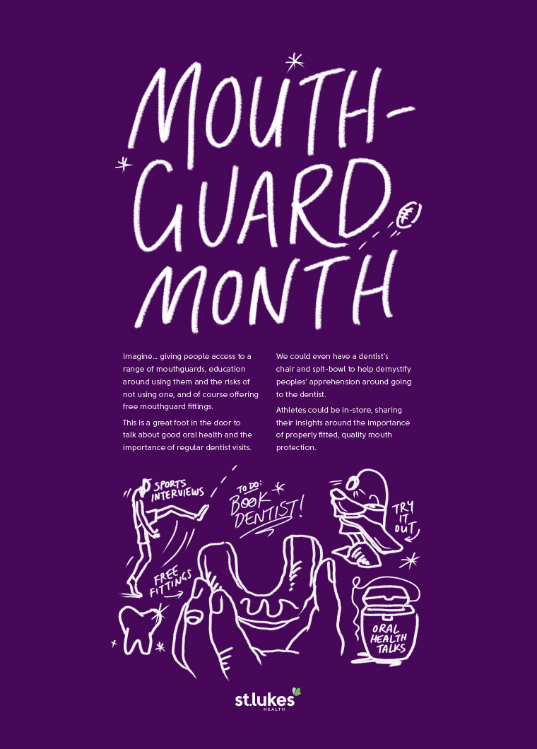
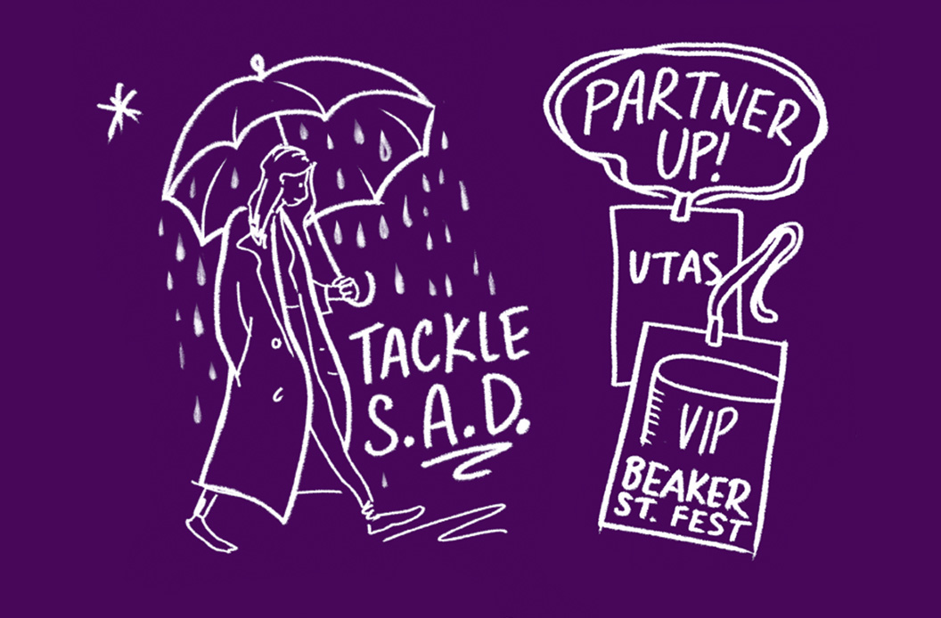
Cathy McAuliffe Design worked with The20 (advertsing agency) on this campaign to launch the new Hobart flagship store for health insurer St Lukes. This innovative building houses the day-to-day operations of the business, but also shares the venue with Tasmanian public. The illustrations, created in a rough 'on the back of a napkin' pencil sketch style, were drawn from a shortlist of 16 ideas for the use of the building. General public were then invited to vote on their favourites and offer feedback on why they thought it was important. Each idea was written up, illustrated and presented on A1 boards around the space. Ideas covered hosting lunchtime lullaby concerts in the store, Q&A sessions with health professionals to demystify ‘health’ issues, through to ‘come and try’ sessions for a different sporting activity each week and even calming dog patting sessions.
The20 then dramatically re-skinned the entire exterior with two-story graphics using our illustrations, giving a hint of what was on offer inside the building, with a promise of more to come.
The event launch was attended by the heads of health-related organisation and professions from across the state to see this bold new health vision.
Cathy McAuliffe Design was responsible for all illustrative deliverables on this job. The drawings were created using iPad and original sketches on paper.
Strategy, Concept, Creative Direction and Production: The20
Design and illustration: Cathy McAuliffe Design